Today, design is very popular and is given a lot of attention because it represents a visual way of communication. Accordingly, there is a science called typography that is dedicated to the most important thing, letters, because they’re the main vessel of clear visual communication.
A #font is a graphic representation of #text that includes different types, shapes, thicknesses, colors, and letter designs. Share on XWhy do you need to choose the right font for emails?
Although choosing a font may not seem particularly important to you when writing an email, it says a lot about your good taste and knowledge of the basics of good business correspondence, so it is very important to pay attention to choosing the right font for the text you send via email. When sending an email, it is important to use a clear and easy-to-read font.
If you choose the correct font, you increase the chance that the recipient will read and understand your message, i.e., that his focus will be exclusively on the points of the text. There are some universal rules related to this topic, and fonts are generally already predetermined where they fit best and how to combine them because there are several types of fonts.
Fonts Ideal for an Email
1. Calibri
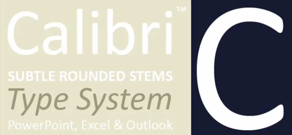
The fact that Calibri is the default typeface for Microsoft Office and many other Microsoft software speaks volumes about how good this font actually is. Calibri font is a sans serif typeface designed by Luc de Groot somewhere between 2002-2004.
It was released to the general public in 2007. As for the look and design of the font itself, the Calibri features subtly rounded stems and corners visible in larger sizes. So, it’s definitely a font with good readability.
2. Georgia
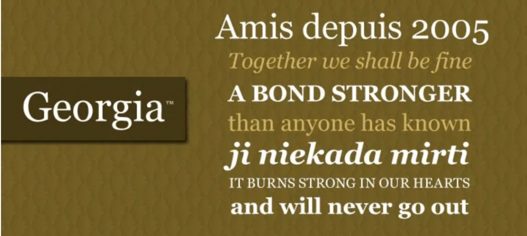
The next font worth mentioning if you need a good email font is the Georgia font. This font is a serif font and was designed in 1993 for Microsoft. As for the design of this font, there are a few beads at the end of the letter.
What certainly makes this font special is the fact that it has established itself in novels and newspapers, and this is where its classicism is shown. If you are aiming for a readable and classy font for your email, this one is a must-have.
3. Verdana
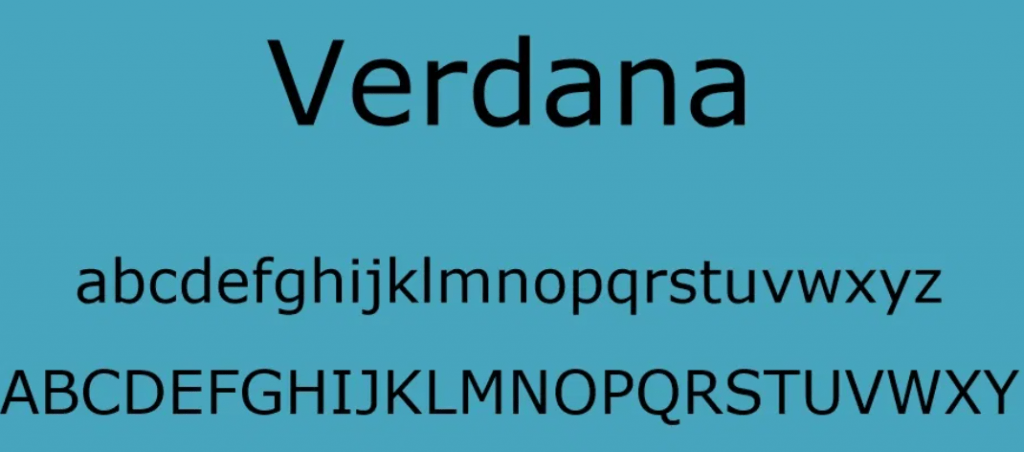
As for this font, it belongs to the group of those that are the easiest to read, so it is serif-free and in the group of web-safe fonts. This font was designed to be readable in very small sizes on low-resolution computer screens, and the lowercase letters of this font are larger than is typical for a font of this type, so it can be a great font for writing your emails because it’s very professional and great for smaller screens as well.
Another interesting fact about this font is the source of the name of this font. Namely, the Verdana font was named after a daughter from Virginia Howlett, one of the developers of this font, which is a combination of two words: Verdant, which means green, and Ana, which is her name.
4. Arial
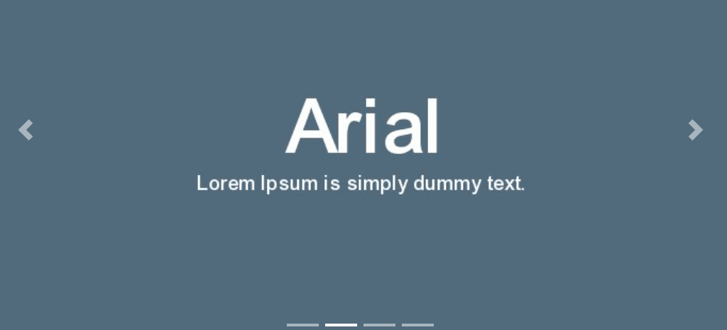
If you want your emails to be readable and you are sure that they will not be formatted and that the recipient of your email will 100% see the font as you saw it, then Arial font is the right choice for you. Simply, when you want to go to for the sure thing, Arial is there because it’s is timeless and multi-purpose due to being around for over 40 years.
The popularity is evidenced by the fact that it is still used in multi-purpose advertisements, magazines, documents, and more. There are so many styles within this font. Arial possesses many human and less mechanical characters. Arial is a sans serif font, and very often, you can find this font under the name Arial MT.
5. Times New Roman
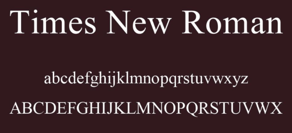
Last but not least is the timeless Times New Roman. Times New Roman is a serif font. It was ordered by The Times of the same name in 1931. Anyone who has opened Microsoft Word at least once is more than familiar with this font. Simply put, this is a trendy font that almost everyone knows about. This font is traditionally known to be the default font for academic papers.
So to make your email look professional while making sure it arrives in the recipient’s inbox just the way you sent it, Times New Roman is a great choice. As for the design of this font, Times New Roman with heavy serifs is actually a modern version of Times fonts, and its characters are concise while the lowercase letters are high with short ups and downs.
Conclusion
Basic fonts like Arial, Verdana, Calibri, and Times New Roman are really almost always a good idea. Also, basic fonts are pretty much a good choice for anything, and these suggested fonts are mostly suitable for emails.
It is also important to use an ordinary font because not all email providers and programs/applications display messages the same way. You do not want the recipient of the message to receive an email with sometimes weird characters in place of letters.