The e-commerce industry is growing exponentially, thanks to technological advancements. And because of online stores, we can now buy whatever our household needs within the comforts of our home. We can even do online shopping on the go using our smartphones.
But this also means that there is a growing #competition of retail brands pivoting to #e-commerce. This is where #web design can be helpful. Share on XAnd when we say “web design,” it is more than just choosing a WordPress theme for your e-commerce website. You should also consider how customers will perceive your brand and whether you can compel them to take action. After all, the goal of having an e-commerce business is to generate sales.
Concerning this, you need to consider how you can make it easy for customers to buy your products. This is where User Interface (UI) and User Experience (UX) come in. That’s because every design element on your e-commerce website can make or break your profit.
That said, we have listed eight e-commerce web design tips that can help you drive more online sales. Enhance your e-commerce platform by incorporating proven web design strategies from design firm websites; these top 8 tips can help you drive more sales and create a seamless user experience.
1. Make it clear and simple
One of the things you need to keep in mind in the e-commerce design process is keeping it simple. When it comes to e-commerce web design, the simpler, the better. The more elements that you place on the page (i.e., banners and pop-ups) take away the entire reason for having a site in the first place, which is to close a sale.
You don’t need to add many bells and whistles to your e-commerce site as they only serve as a distraction. It would be best to keep your site clean and simple. Doing so allows you to focus on making sales.
2. Simplify the checkout process
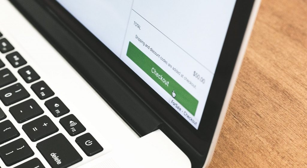
Most of the time, people fill in their checkout carts, only to abandon them. If you’re wondering, that’s because the entire checkout process was too complicated.
So make sure that the following strategies should keep your checkout process quick and easy:
- Make sure that you place different payment options and make it as user-friendly as possible.
- Don’t ask users too many questions before checkout.
- Keep the navigation simple. Don’t complicate things by placing too many CTAs after the payment is made.
3. Add a shopping cart icon
So you’ve probably noticed that a lot of e-commerce sites have that small shopping cart icon somewhere along on every page. Often, you can find it at the top right corner so that users can view items that they’ve placed on their cart.
This is one of the essential e-commerce design elements out there. Making this icon visible at all times has been proven to boost conversion rates for customers who are doing online shopping.
Just ensure that the icon updates in real-time to be recognized as a shopping bag or cart easily. The last thing you want to happen is to confuse people since it’s probably one of your site’s essential buttons.
4. Upload high-quality product images
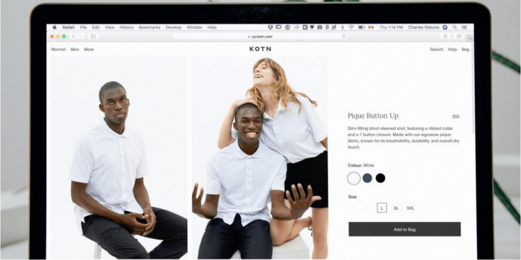
Unlike in brick and mortar stores, one of the common dilemmas of online shoppers is that they couldn’t see or touch the products in person. To help ease this pain point, you need to look for ways to improve your e-commerce design using high-quality product photos.
You might even consider using videos, depending on the product. Using high-resolution photos is necessary. Any blurriness, or pixelation on these photos, can drive your customers away since they think your products are cheap.
5. Organize the navigation menu
Your navigation menu should show up either vertically on the left side or horizontally on the very top of your site across all of the pages.
At Sytian E-commerce Website Design Philippines, we always advise that the display navigation menu be organized to make locating your products as straightforward as possible. An excellent navigation menu should let your customers find your products quickly.
You can also use a dropdown menu functionality to showcase different product categories and subcategories.
6. Highlight customer reviews

Social proof is something that a lot of customers live by. Usually, shoppers tend to avoid purchasing products that don’t have any reviews. A lot of e-commerce sites are also using customer reviews to boost their sales.
Amazon is the perfect example of this. It features reviews of every product and allows customers to review or share snapshots of the product, as well as their experience. Moreover, there are plenty of ways that people can rate and review products.
For instance, clothing retailers may categorize these ratings depending on the following:
- Product design
- Comfort
- Quality
- Fit
7. Support fast scanning
When shoppers get to your online store, they probably want to look for information as quickly as possible. Having the proper page layout, formatting, and CTA button placement lets them know where to look and improves the user experience.
Utilizing bullets, headings, short paragraphs, and sentences also let customers efficiently scan content. They can put the essential information on the top left of the page to match the natural F-shaped scanning patterns.
By making your product description scannable, you can place all the product details that customers seek. This includes the size, weight, materials of a product without placing any obstacles along the way.
8. Ensure responsive design
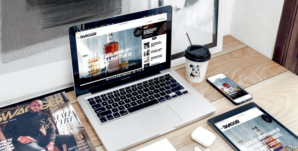
More and more e-commerce consumers are on mobile than ever before. That’s why it’s crucial more than ever to provide excellent web design both on desktop and mobile.
Although you can build a mobile app, the bare minimum that you need is to make a responsive site design. Having one ensures that your site design can be adjusted in a way that is based on the user’s screen size and orientation.
By doing so, your site can cater to users on different platforms, making sure that you’ll be earning sales from mobile, tablets, desktops, etc.
Over to You
You don’t need a big budget when designing an e-commerce website.
The key here is to include elements that make it easy for your customers to buy your products. This also explains why you should understand your customers well. Otherwise, you cannot determine how you can make your online look appealing.