When examining the logos of major brands throughout history, it becomes apparent that one trend has gained unstoppable momentum in the last decade: minimalism. Gone are the ornate, detail-packed logos of yesteryear. Replacing them are flat, stripped-down, almost childishly simple designs that sometimes leave people scratching their heads—or bursting into laughter. Minimal logo design has flourished, not because brands are getting lazy, but because they’re tapping into the raw power of thoughtful simplicity. But when simplicity goes extreme? That’s when things start to get amusingly interesting.
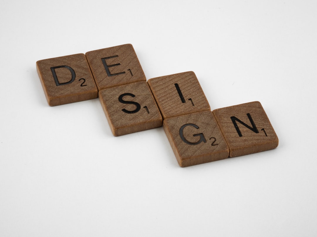
What Is Minimal Logo Design?
At its core, minimal logo design embraces the mantra: “Less is more.” The idea is to convey a brand’s identity using as few elements as possible—no flashy gradients, no decorative frills, often not even shadows or outlines. Instead of complex symbolism, these logos rely on streamlined geometry, basic typography, and clean use of space to create a distinctive impression.
But let’s be real—sometimes what’s intended as “clear and confident” ends up being “vague and hilarious.” This is where minimalism crosses over into comedy territory, yielding logos so pared down that they raise more questions than answers.
Why Has This Design Approach Become So Popular?
Brands are continually trying to connect with younger, digitally savvy audiences. Simplicity is functional; minimalist logos are:
- Highly scalable – They look crisp on a billboard or your smartwatch.
- Timeless – Fewer gimmicks mean fewer trends to chase.
- Memorable – The simplicity makes them easier to recall (theoretically).
- Clean and modern – Which aligns with today’s less-is-more design aesthetic.
Yet, sometimes the pursuit of minimal elegance leads to something unintentionally humorous—logos that look like doodles on a napkin, or worse, icons you might confuse with restroom signage.
When Simplicity Becomes Hilarity
One of the most famous examples of controversial minimal logo rebranding was when Yahoo! redesigned their logo in 2019. They shifted to a more minimal, sans-serif approach that left many wondering if it was an April Fool’s joke. It wasn’t. But the real issue was that the new logo didn’t add any emotional value—it was so generic, it could’ve belonged to any tech company, startup, or even toothpaste brand.
Another example: in 2021, the French luxury fashion house Balmain updated its logo to a minimal monogram using a geometric “B” that, to some, resembled either a bank’s icon or an old phone app. While designed with noble intentions, such redesigns often end up as memes as quickly as they are revealed.
The gap between design intent and public perception is where the comedy lies. Designers speak of elegance and reductionism; the internet responds with “It looks like my 8-year-old drew that in MS Paint.”
The Art and Science Behind Reductive Logos
A truly well-crafted minimalist logo isn’t just about dropping elements at random. It’s about distillation: boiling something detailed down to its most essential form.
Here are the routine steps taken in minimalist logo creation:
- Research – Understand the brand’s history, audience, and core message.
- Sketching ideas – Boiling down complex concepts into essential lines and shapes.
- Typography selection – Choosing a clean, readable typeface (often sans-serif).
- Testing – Checking how it looks on everything: apps, t-shirts, delivery trucks.
- Refine and simplify – Eliminate anything that doesn’t contribute to identity.
In theory, this process yields logos that possess both elegance and function. In practice? Well, let’s just say things don’t always go as planned.
When Brands Get It Right
Not all minimalist logos are head-scratchers. Some brands have absolutely nailed the balance.
- Apple – The half-bitten apple has evolved only slightly over the years. Today’s clean, monochromatic version is iconic and speaks volumes without saying a word.
- Nike – That swoosh is the poster child of effective minimalism. Abstract, but loaded with motion and energy.
- Spotify – The simple wave form icon in a comforting green circle is both modern and instantly associated with music streaming.
These logos succeed because they condense meaning, identity, and recognition into basic yet powerful forms.
Then There Are the Mishaps
Of course, we couldn’t talk about minimal logos without addressing the moments when reduction goes rogue. Take, for instance, the 2020 logo redesign of Pringles, who abandoned Mr. Pringle’s detailed mustache and eyes for an emoji-esque floating face of vague origins. Fans mourned the personality loss, while others joked that he looked like a bootleg sticker you’d find in a knockoff cereal box.
And let’s not forget the London 2012 Olympics logo—a chaotic mass of shapes representing, ostensibly, the numbers “2012.” While it achieved a minimalist aesthetic in terms of flat design, its abstract nature made it the butt of endless jokes online. What was meant as edgy and modern was perceived as something your toddler might whip up in Canva when left unattended.
How to Avoid Unintended Logo Laughter
Here are some simple do’s and don’ts to navigate minimal logo design without turning your brand into comic relief:
Do:
- Keep your brand’s essence intact—even when simplifying.
- Make sure the logo is distinctive and doesn’t resemble existing ones.
- Test across multiple mediums—print, digital, and social platforms.
Don’t:
- Strip away so much that the logo becomes meaningless.
- Use generic fonts that could be mistaken for default styles.
- Over-explain your design—if it needs a novel to be understood, it’s probably not working.
Final Thoughts: When Less is More (and Funnier)
Minimal logo design isn’t just a passing fad—it’s a response to the ever-demanding digital age. With screens of all sizes, attention spans measured in seconds, and global competition just a tap away, there really is value in keeping things clean and fuss-free.
Yet, it’s that very tightrope walk between brilliance and absurdity that makes this trend so fascinating—and often unintentionally funny. Whether you’re a designer, a business owner, or just someone who enjoys a good brand blooper, there’s something undeniably entertaining about watching minimalism go a step too minimal.
Because sometimes, less really is hilariously more.