


User experience design is no longer just about making things look good—it is about crafting meaningful, efficient, and even delightful interactions between people and digital products. The best UX design examples do not simply showcase aesthetic appeal; they demonstrate how thoughtful decisions can reduce friction, build trust, and create emotional connection. By examining expert-selected UX design examples, we can uncover practical lessons that apply to websites, mobile apps, SaaS platforms, and beyond.
TL;DR: Great UX design focuses on clarity, simplicity, and user-centered thinking. Studying standout examples from companies like Apple, Airbnb, Duolingo, and Amazon reveals practical lessons in onboarding, personalization, navigation, and feedback. The most successful experiences remove friction, guide users naturally, and build trust through consistency and transparency. You can apply these same principles—clear navigation, thoughtful microinteractions, and data-driven iteration—to your own digital products.
1. Apple: Simplicity as a Strategic Advantage
Apple’s website and product interfaces are often cited as gold standards in UX design. What makes them exceptional is not flashy animation or dense information—it is clarity. Every page has a single, dominant focus. Calls-to-action are obvious. Navigation is predictable.
This approach demonstrates three critical UX lessons:
- Visual hierarchy matters. Important elements stand out naturally through size, spacing, and contrast.
- Whitespace improves comprehension. Minimal clutter helps users process information faster.
- Consistency builds confidence. Apple maintains predictable design patterns across devices and platforms.
Rather than overwhelming users with technical specifications, Apple guides them step by step. Each scroll reveals carefully sequenced content. The experience feels effortless because it anticipates what users care about most.
What you can learn: Reduce cognitive load. Make one primary action clear. Remove anything that doesn’t serve user goals.


2. Airbnb: Frictionless Search and Personalization
Airbnb transformed travel booking by making the browsing experience both highly functional and emotionally engaging. From the moment users land on the homepage, the interface encourages exploration.
Airbnb excels in:
- Smart defaults. The system pre-fills locations and suggests dates.
- Personalized recommendations. Listings adapt to browsing behavior.
- Clear filtering options. Users can narrow results without complexity.
The search flow is powerful yet unobtrusive. Filters slide in smoothly. Pricing is transparent. High-quality imagery builds trust. Most importantly, the experience feels tailored rather than generic.
Another standout feature is trust-building. User reviews, host ratings, and verified badges reduce uncertainty—critical in peer-to-peer marketplaces. The UX doesn’t just help users find places; it helps them feel safe booking them.
What you can learn: Guide users with smart suggestions, but never overwhelm them. Use personalization to simplify decisions rather than complicate them.
3. Duolingo: Engagement Through Microinteractions
Duolingo is a masterclass in gamified UX design. Learning a language can feel intimidating, yet the app breaks it into digestible tasks and reinforces progress through feedback.
Key elements include:
- Instant feedback. Users immediately know if answers are correct.
- Progress indicators. Visual trackers motivate continued learning.
- Delightful animations. The mascot celebrates achievements.
These seemingly small touches—often referred to as microinteractions—play a big role in keeping users engaged. Instead of presenting large milestones only, Duolingo rewards incremental progress. This stimulates a sense of achievement and encourages habit formation.
Notably, the interface is colorful but not chaotic. Buttons are large and readable. Lessons are short. Every interaction feels achievable.
What you can learn: Reinforce user effort with feedback. Break complex tasks into smaller wins. Emotion matters just as much as function.

4. Amazon: Usability Over Aesthetics
Amazon’s interface is not minimal or trendy. In fact, many designers criticize its layout. Yet it remains one of the most effective e-commerce platforms in history. Why? Because it prioritizes usability and conversion clarity above all else.
What Amazon gets right:
- Powerful search functionality. Autocomplete and filtering simplify product discovery.
- Customer reviews as decision drivers. Social proof reduces hesitation.
- Clear purchase pathways. “Buy Now” is unmistakable.
Every major UI choice aligns with one question: “Does this help users buy faster and with confidence?” The answer is almost always yes.
Amazon’s checkout process is another UX triumph. Saved payment methods, one-click ordering, and transparent shipping timelines all reduce friction. While visually busy, the system makes decision-making efficient.
What you can learn: Great UX isn’t always visually trendy. Prioritize effectiveness and user intent over aesthetics.
5. Spotify: Seamless Cross-Platform Experience
Spotify delivers a consistent experience across mobile, desktop, tablet, and even smart TVs. This cross-platform alignment ensures users never feel lost when switching devices.
Highlights include:
- Consistent navigation structure.
- Personalized playlists powered by data.
- Smooth content transitions.
Spotify’s Discover Weekly is especially noteworthy. It uses data-driven UX to create personalized engagement that feels curated rather than algorithmic. Users feel understood.
The dark interface, recognizable icons, and uniform controls make transitions between devices seamless. This builds familiarity and reduces learning curves.
What you can learn: Ensure consistency across platforms. Invest in personalization that genuinely adds value.
6. Notion: Flexible Yet Intuitive Productivity
Notion balances flexibility with usability—no small task for a productivity app. It allows users to build custom workflows while keeping the interface relatively clean.
Notion succeeds because of:
- Modular design blocks. Content adapts to user needs.
- Slash commands. Quick actions reduce friction.
- Clean typography. Focus remains on content.
Instead of overwhelming first-time users with features, Notion uses templates to demonstrate possibilities. The onboarding guides rather than dictates.
What you can learn: Offer flexibility, but scaffold it with structure. Give users starting points to avoid paralysis.

Common Principles Behind Great UX
Across these examples, several patterns consistently appear. Whether it is Apple’s refinement or Amazon’s efficiency, great UX shares foundational traits.
1. Clarity Over Complexity
The best interfaces communicate purpose immediately. Users should never wonder, “What do I do next?”
2. Feedback at Every Step
From loading indicators to success animations, feedback reassures users that the system is responding.
3. User-Centered Thinking
Successful products align design decisions with actual user needs, often validated through testing and data.
4. Reduced Friction
Removing extra steps, simplifying forms, and offering shortcuts can dramatically increase engagement and conversions.
5. Emotional Engagement
Delightful microinteractions and personalization humanize digital experiences.
How to Apply These Lessons
You do not need enterprise-level resources to incorporate these insights. Start with practical strategies:
- Conduct usability testing. Observe how real users navigate your product.
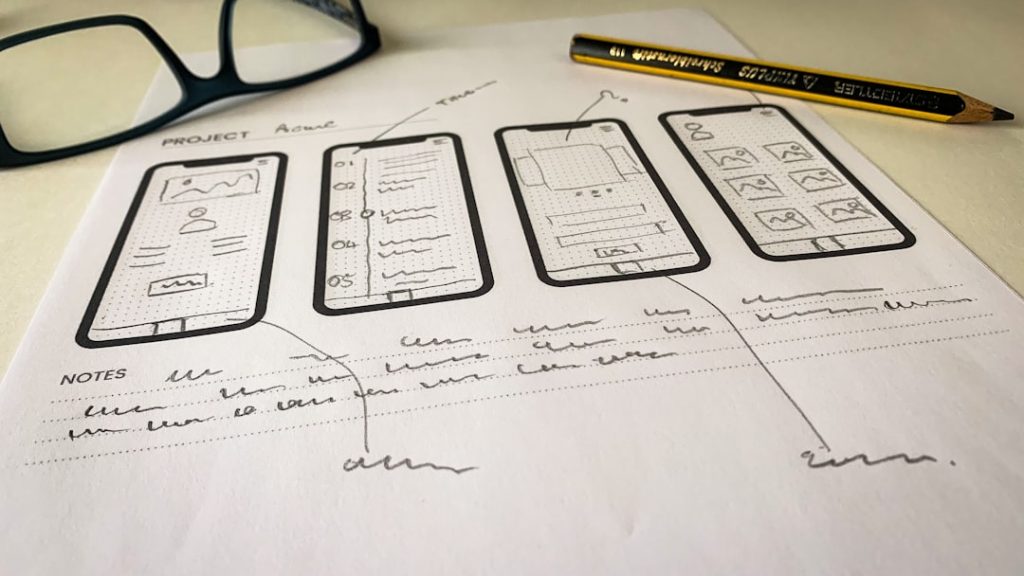
- Create wireframes first. Focus on structure before styling.
- Prioritize mobile responsiveness. Many users engage primarily on phones.
- Measure behavior data. Heatmaps and analytics reveal pain points.
- Iterate continuously. UX is never finished.
Even incremental improvements—such as simplifying a checkout form or clarifying button labels—can significantly enhance user satisfaction.
The Future of UX Design
As artificial intelligence, voice interfaces, and immersive technologies evolve, UX design will continue expanding beyond screens. However, the same principles will apply. People will always value clarity, responsiveness, and empathy in their interactions with technology.
Expert-selected UX examples remind us that innovation is not about adding features—it is about refining experiences. Whether designing a startup product or optimizing an established platform, the goal remains consistent: make the user journey intuitive, meaningful, and seamless.
By studying the best, you gain more than inspiration. You gain a blueprint for crafting experiences that users not only tolerate—but genuinely enjoy.