
Creating a brochure might seem tricky, but it can actually be fun! A great brochure doesn’t just look pretty — it works hard. It grabs attention, shares a clear message, and convinces people to take action. So, what makes a brochure successful? Let’s dive into the key elements that make your brochure shine.
1. A Clear Purpose
Before anything, know why you’re making the brochure. Is it for promoting a product? Sharing company info? Announcing an event?
Once you know the goal, everything else becomes easier. Your message, design, and layout should all serve this purpose.
2. An Eye-Catching Cover
The cover is like a welcome mat. Make it exciting!
- Use strong, bold images
- Keep the title short and punchy
- Include your logo
If the cover doesn’t grab attention in 3 seconds, people may not open it.
3. Simple and Clear Content
Don’t crowd the page with too much text. Keep it simple.
- Use short paragraphs
- Use bullet points
- Get to the point quickly
Your readers are busy. Make it easy for them to understand what you’re offering.
4. Engaging Headlines and Subheadings
Large blocks of text are boring. Break them up!
Use headlines to guide the reader. They make the brochure easy to skim. Each one should give a clue to what follows.
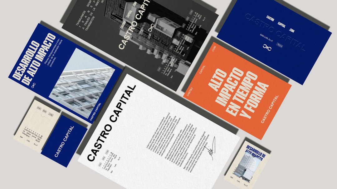
5. Eye-Friendly Design
Design matters — a lot. People notice how something looks before they read it.
Here are some simple design tips:
- Use 2-3 matching colors
- Stick to 1-2 fonts
- Leave some white space
Remember, less is more. Don’t clutter!
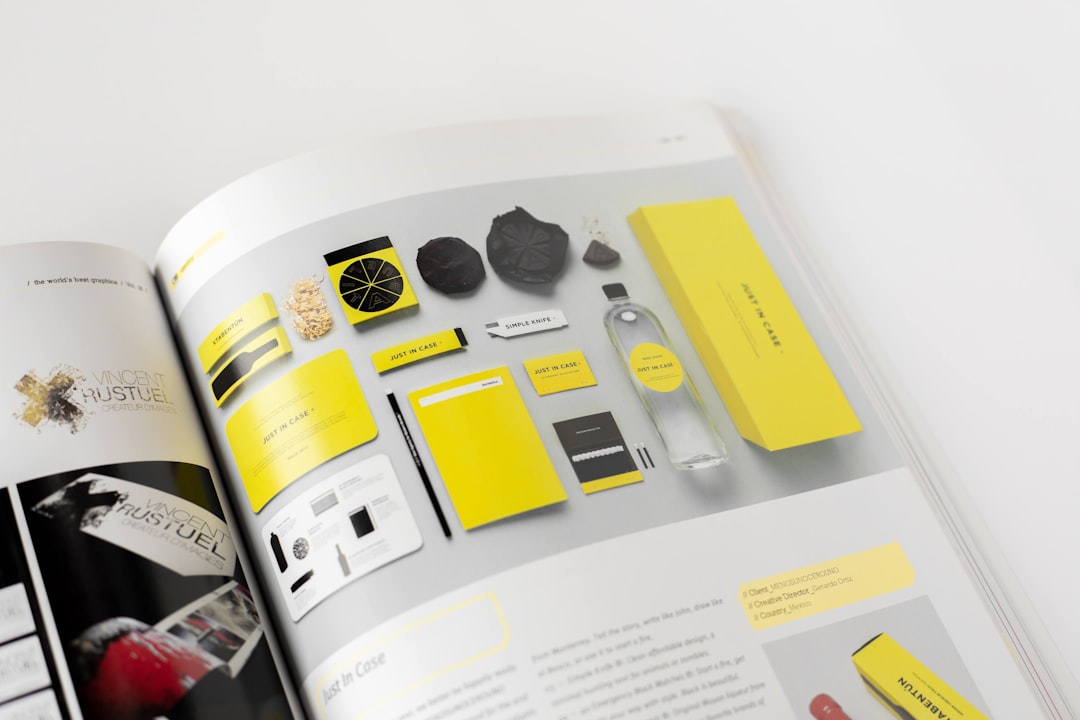
6. Quality Images
A picture is worth 1,000 words. So, use great images!
- Use high-resolution photos
- Avoid cheesy stock photos
- Pick images that match your message
Images help people connect with your product or idea emotionally. Choose wisely.
7. A Strong Call to Action (CTA)
What do you want readers to do after reading?
Tell them clearly! Use simple action phrases like:
- “Call us today”
- “Visit our website”
- “Sign up now”
Put your CTA in more than one spot. Make it big and bold!
8. Important Contact Information
Don’t forget how people can reach you.
Always include:
- Phone number
- Website
- Social media (if relevant)
Bonus points for a QR code that links to your site!
9. Balance Between Text and Visuals
A great brochure mixes information with visuals. Too much of one makes it dull or confusing.
Try this rule: 50% visuals, 50% text. Of course, it depends on your purpose, but it’s a good starting point.
10. A Logical Flow
Your brochure should guide the reader like a story. Start with the big picture, then get into the details.
A typical flow looks like this:
- Cover and title
- Introduction to the topic or product
- Details and benefits
- Testimonials or proof
- Strong call to action
Final Touches
Before printing or sending your brochure, double-check everything!
- Proofread for typos
- Test your CTA links
- Make sure the layout works on screen and paper

And there you have it! With these key elements, your brochure will not only look good — it’ll work hard for you. So go ahead and create one that people will want to read and keep!